ui Design, Foundations
NOOK DESIGN SYSTEM

historical Context
Despite eReader adoption far exceeding tablets, the idea of reading devices as compared to books was still fringe. Users were emotionally tied to the familiar sensory experience of a traditional book. Health studies challenged the notion of prolonged reading sessions with respect to visual fatigue. The digitization of books was altering the ways in which information was produced, disseminated, and ultimately displayed.
My team and I defined the visual language, fleshed out all UI patterns and interactions, and organized working assets into a comprehensive style guide to be shared across functions.
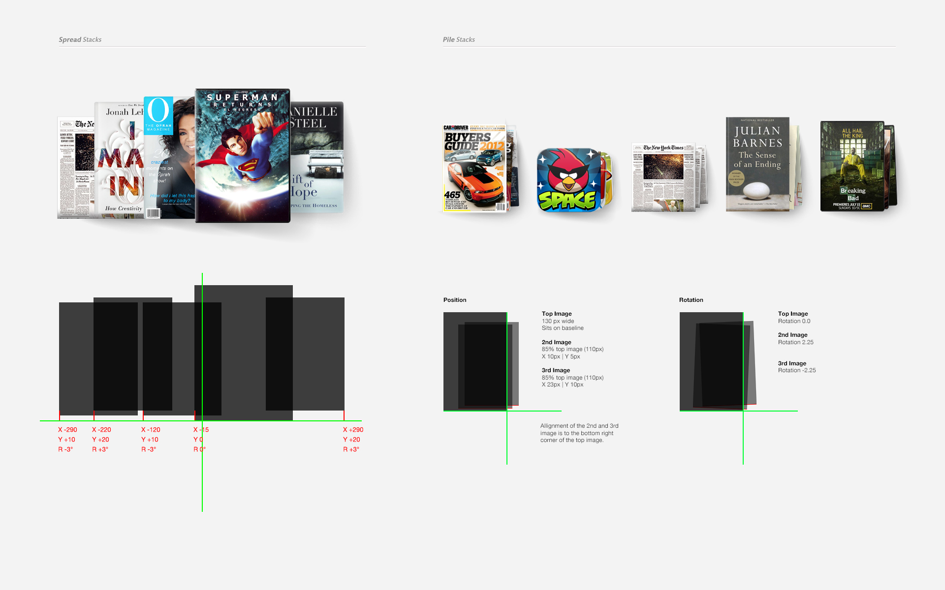
color story
A grey color palette compliments the illumination technology and minimizes eye strain during long periods of reading. In the Shop and Library sections, the seemingly bare canvas offers a quiet space that allows the content to shine. Books, magazines, and apps become identifiable making it easy to quickly scan across titles.
emotional Connectivity
The UI is defined with a paper-like look and feel and strikes a more natural connection between user and device. Soft drop shadows and neutral greys retain the reflective qualities of paper when viewed on the low-lit LED screen with its matte satin surface. Visible "fibers" add texture and a more tactile quality to the overall experience.